Mathematics - Class ...

Topic outline
-
Math - Class 4 – Data Handling (Pictograph, Bar graph, Pie graph)/Data and Graphs/Read a Table/Interpret Bar Graphs and Pie Chart/- Key Points/Notes/Worksheets/Explanation/Lesson/Practice Questions Tags: Free Worksheet PDF on Data Handling for class IV, Lesson on Introduction to Handling Data/Smart Charts for class 4, Pie chart, Pie graph, Circle graph and Bar chart, bar graph, column graph, bar chart, Graph examples, column chart, Data handling worksheet PDF for fourth standard, Practice page on graph for 4th grade, Quiz on data handling, Study the pie graph, then answer the questions. When we represent numerical data through pictures or graph, it is termed as pictorial representation of data. Representing numerical data by dividing a circle into slices or sectors is called pie chart or pie graph or circle graph. Bar graph is the simplest form of representing data by displaying rectangular bars of different heights proportional to the value they represent.
-
Data Handling
Pictorial Representation of Data
When we represent numerical data through pictures or graph, it is termed as pictorial representation of data. Such visual representation makes our understanding more clear.
In pictograph we use icon, pictures, symbol etc. repetitively, to show the relationship between two variable quantities. Pictograph can also be referred as pictogram, pictorial chart, pictorial graph, or picture graph. The quantity that each symbol or picture symbolizes is specified clearly in the representation, this helps to represent large quantities of data.
Example: The below graph shows how many oranges were sold in 3 weeks
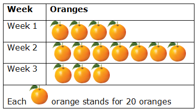
Now, answer the following questions:
Q1. How many oranges were sold during the third Week?
Ans. 20 x 3 = 60 oranges (as each orange stand for 20 oranges)
Q2. In which Week the oranges sold were maximum?
Ans. In Week 2
Pie Chart / Pie Graph
Representing numerical data by dividing a circle into slices or sectors is called pie chart or pie graph or circle graph. Each sector in pie chart represents a fraction of whole. It is simple to understand as it summarizes a large data in visual form.
Example: In a circle below are the details of library books in the school library.
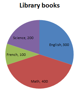
Now, answer the following questions:
Q1. How many books are there in the library in all?
Ans. 1000 books
Q2. Name the subject on which least number of books is there in the library.
Ans. French, 100
Q3. Find the number of books on Math subject in the library.
Ans.400
Q4. Work out the difference between the number of French books and English books.
Ans. English Books – 300
French Books – 100
Difference = 300 – 100
= 200
Bar Graph/Column Chart
Bar graph is the simplest form of representing data by displaying rectangular bars of different heights proportional to the value they represent. Bar graph can also be referred as bar chart, column graph, and column chart.
The bars can be plotted vertically or horizontally. Bar graph makes comparison easier. The title of the bar graph tells what the graph is about and bars of different height tell the facts or information. Each bar represents a quantity for a particular group.
Example: The graph shows different grades scored by students in grade 4.
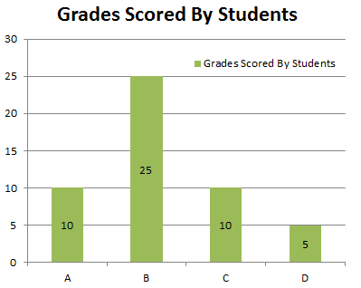
Now, answer the following questions:
Q1. How many students scored Grade B?
Ans. 25 students
Q2. Which Grade was least scored?
Ans. Grade D
Q3. How many student scored Grade A?
Ans. 10 students
Q4. How many students are there in grade 4?
Ans. 10 + 25 + 10 + 5 = 50 students
-
-
-
-